I’ve been finishing up the semester and talking about random walks and Brownian motion. In order to add some images to my course notes at https://www.softcover.io/read/bf34ea25/math_for_finance, I made some quick Python calculations:
Simple symmetric random walk: The laziest thing I could think of was to use the binomial function from numpy. It returns 0 or 1, so I simply translated it (x->2x-1) so that I can get 1 or -1 instead.
from math import sqrt
import numpy as np
import matplotlib.pyplot as plt
%matplotlib inline
def RandomWalk(N,d):
walk = np.cumsum(2*np.random.binomial(1,.5,N)-1)
return walk
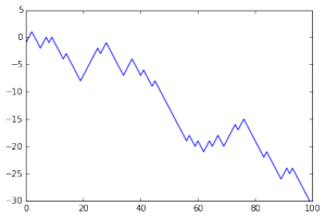
It’s easy then to plot this:
plt.plot(np.arange(100),RandomWalk(100,1))
plt.show()

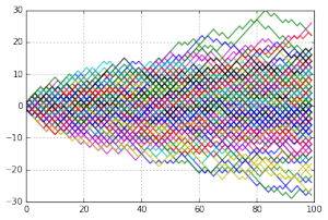
Of course, rather than looking at one random walk, it’s more fun to look at a bunch. Here’s 180 simple symmetric random walks:

I plotted this using the following code:
endpoints = []
for k in range(180):
particularWalk = RandomWalk(100,1)
endpoints.append(particularWalk[-1])
plt.plot(np.arange(100),particularWalk)
grid(True)
plt.show()
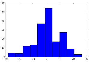
This also peeled off the endpoints of the walks (at step 100), so that I could make a histogram of the positions at time 100:

The idea is to show the distribution of S_100, position at time 100. We know that as n goes to infinity we can say that the limiting distribution for S_n is the normal distribution; 100 is quite far from infinity but even there we start getting some idea of the distribution.
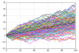
I also generated some asymmetrical simple random walks — still one step of length 1 each time unit, but now one direction is more probable than the other:

This above is a random walk with P(X=1) = 0.6 and P(X=-1)=0.4. The expected value is plotted with the black line on top.
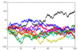
And last, I showed what horrible things can happen if you scale time (taking steps in the random walk more quickly) without scaling time:

The variance goes crazy (not that I showed that) and the character of the walks seems to change. Yes, that’s touchy-feely talk, but I want people to have a feeling for the shape of Brownian motion. I’ll put some of that up later!
